A Flexible View Control for XPages Part 10 – Multiple Views Using Tabs
Posted: May 11, 2020 Filed under: Bootstrap, DataTables, Domino, Flexbox, JavaScript, XPages | Tags: Bootstrap, Domino, Flexbox, JavaScript, XPages Leave a commentIf you’ve been a Domino Developer long enough, then you remember when embedded views were added to Lotus Notes (version 5?) and how it turned your world upside down with the information you could easily make available to users on one form.
Combining The Flexible View Control with Bootstrap tabs makes adding this type of functionality to your XPages application incredibly easy. The demo below uses the used car database to display a few different types of large SUVs on one XPage in different tabs. Each tab is sourced from the same view that contains 2.2 million documents but is categorized creatively to easily drill down to the desired data.
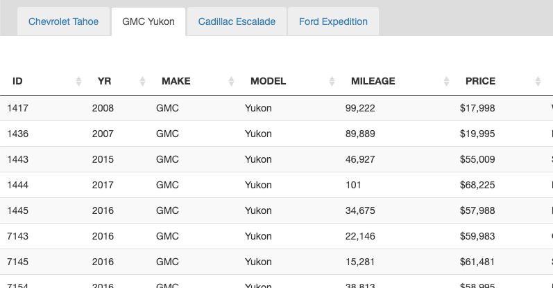
Now, you don’t have to use Bootstrap tabs (or any tabs for that matter) – I do since I’m using Bootstrap as my layout framework and this page has the standard out-of-the-box tab setup with a tab strip navigator and tab. The entire page layout looks like this:
<div class="level0-flex-container">
		<div class="level0-flex-item">
			<xc:ccNav></xc:ccNav>
		</div>
		<div class="level0-flex-view">
			<div class="level0-flex-item" style="padding-top:10px;background:#ddd">
				<ul class="nav nav-tabs" role="tablist">
					<li role="presentation" class="active" style="margin-left:25px;">
						<a href="#tahoe" aria-controls="tahoe" role="tab" data-toggle="tab"
							class="tahoe">
							Chevrolet Tahoe
						</a>
					</li>
					<li role="presentation">
						<a href="#yukon" aria-controls="profile" role="tab" data-toggle="tab"
							class="yukon">
							GMC Yukon
						</a>
					</li>
					<li role="presentation">
						<a href="#escalade" aria-controls="messages" role="tab"
							data-toggle="tab" class="escalade">Escalade</a>
					</li>
					<li role="presentation">
						<a href="#expedition" aria-controls="settings" role="tab"
							data-toggle="tab" class="expedition">Expedition</a>
					</li>
				</ul>
			</div>
			<div class="tab-content"
				style="">
				<div role="tabpanel" class="tab-pane active flex-tab" id="tahoe"
					style="">
					<Flexible View Control>
				</div>
				<div role="tabpanel" class="tab-pane flex-tab" id="yukon"
					style="">
					<Flexible View Control>
				</div>
				<div role="tabpanel" class="tab-pane flex-tab" id="escalade"
					style="">
					<Flexible View Control>
				</div>
				<div role="tabpanel" class="tab-pane flex-tab" id="expedition"
					style="">
					<Flexible View Control>
				</div>
			</div>
		</div>
</div>
Flexbox, again
If you read Part 8 of this series, then you probably remember how important of a role Flexbox plays in the layout of the Flexible View Control. Getting the FVC to size properly in a Bootstrap tab panel is no different. We add a little extra CSS to make those tab panels flex so the view control fills up the available space in each tab:
.tab-content {
	flex:1;
	position:relative;
	flex-basis:auto;
	display:flex;
	flex-direction:column;
}
.tab-pane.flex-tab {
	display:flex;
	flex:1;
	position:relative;
	flex-basis:auto;
	flex-direction:column
}
.tab-pane.flex-tab {
	display:none !important;
}
.tab-pane.flex-tab.active {
	display:flex !important;
}
Now that the page is laid out we can add our view controls to each tab panel. The image below shows the FVC for the first tab, although the other three tabs are essentially configured the same.
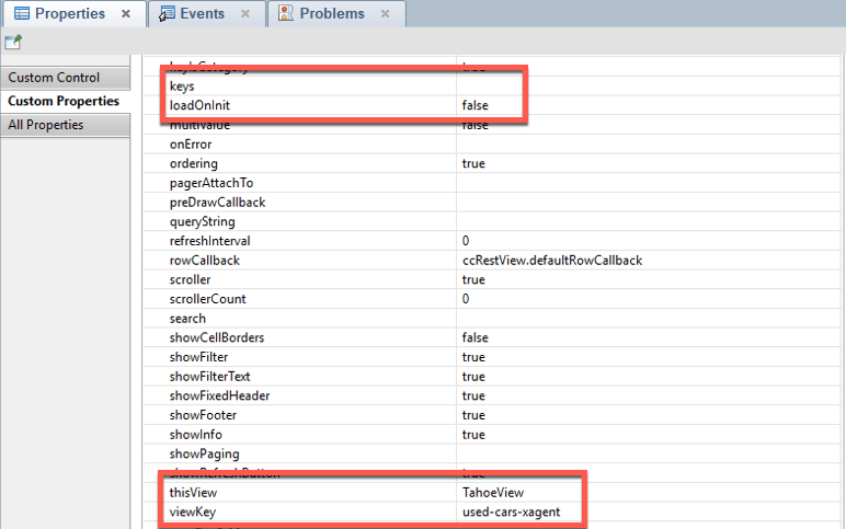
Remember: thisView must be unique! This is what allows multiple views to be added to one XPage.
An important takeaway from the highlighted areas in the screenshot above: loadOnInit: false. Setting loadOnInit directly in the control will override the value defined in the View Definition. We set it to false here because we want to build the table manually, and even though the page has four views, we only want to fetch the data for the ‘active’ tab when the page loads:
$( document ).ready(function() {
	TahoeView.build({
				params: 'category=make:Chevrolet:model:Tahoe&view=xspAll'
	});
}
- When loadOnInit: true the control will automatically execute the .build() function.
- When loadOnInit: false the DataTable can be built manually by calling [thisView].build().
- Refresh a view at anytime by calling [thisView].build()
So how do we load the data for the other tabs? In Part 7 – Modals & Picklists, we talked about needing to wait until a modal was ‘shown’ before building the view in a Picklist to make sure that the DataTable sized correctly. Similarly here, to load a view in a tab we need to wait until that tab is ‘shown’. To do that, again, we tap into a Bootstrap event:
$('.tahoe').on('shown.bs.tab', function (e) {
	// Even though this view is built on page load
	// the shown property can be set so the view refreshes
	// when this tab is made active again
		TahoeView.build();
});

$('.yukon').on('shown.bs.tab', function (e) {
		YukonView.build({
			category:'make:GMC:model:Yukon',
			params:'view=xspAll'}
		);
});

$('.escalade').on('shown.bs.tab', function (e) {
		EscaladeView.build({
			'category':'make:Cadillac:model:Escalade',
 			params:'view=xspAll'});
});

$('.expedition').on('shown.bs.tab', function (e) {
		ExpeditionView.build({
			category:'make:Ford:model:Expedition',
			params:'view=xspAll'});
});
What about those .build() parameters?
As you probably noticed in the snippets above, we didn’t define the keys/category for the views within the control. We could have, but the FVC makes it possible to pass options to the .build() command. This is a huge part of what makes the Flexible View Control so ‘flexible’. More in this in the next blog post!
 XPage.me