Flexible View Control for XPages – Mashing Up Total Columns and Category Renderers
Posted: December 14, 2020 Filed under: DataTables, Domino, JavaScript, jQuery, low-code, XPages | Tags: DataTables, Domino, JavaScript, jQuery, low-code, XPages 1 CommentIn a recent blog post we covered the concept of ‘Category Renderers’, which allows the user to easily alter the visual representation of category rows in a categorized View. Combining this functionality with totals columns, highlighted in the last blog post in this series, we can further enhance Views in XPages and make them more user-friendly than their Notes counterparts.
The Mission
Continuing with our dataset from previous posts of used cars available in Wilmington, DE I want to display the average PRICE of each MAKE of vehicle. In my View Definition I categorize the MAKE column:
Note: As you can see in the screenshot below, the View Definition has an option to display average values. This option currently doesn’t function properly and will be updated in the next release.

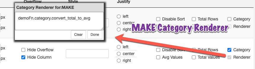
Then I add a Category Renderer to the MAKE column:
And I still have totals enabled for PRICE and MILEAGE:

The Category Renderer
The demoFn.category.convert_total_to_avg function is a function in a client-side js library. Remember, you do not provide any parameters to the function. This function is applied to every category row and the dom object for that category is automatically passed into the function as a parameter.
convert_total_to_avg : function(_this) {
	// _this is the category row dom element
	// take a total value for a category and instead display the avg value

	// get the total # of rows for this category
	var total_rows = $('.total_rows',$(_this)).html();

	// get the total PRICE for this category
	var total_value = $(_this).attr('total_price_values');

	// format the column that contains the total #
	$('.MILEAGE_total',$(_this)).html(total_rows+' (total)');

	// calculate and format the average price
	$('.PRICE_total',$(_this)).html('$'+$U.formatMoney((total_value/total_rows),0)+' (avg)');
}
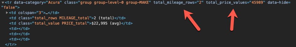
Notice in the code above we are extracting the total_value from the attributes of the category tr. We are able to do so because when totals are enabled for a categorized column the Flexible View Control stores the accumulated data in the tr element for easy access:
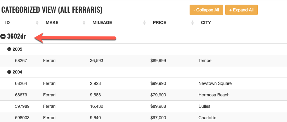
The Result
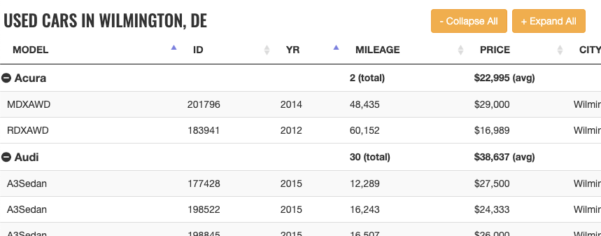
Here is our result:
What About The Footer?
While we are achieving the desired outcome for each category, the footer still displays the total PRICE for all used cars in Wilmington, DE.

How do we get the average price for all used cars instead? In the next post we’ll show you how!
Flexible View Control for XPages – Category Renderers
Posted: December 2, 2020 Filed under: Bootstrap, DataTables, Domino, JavaScript, low-code, XPages | Tags: DataTables, Domino, JavaScript, low-code, XPages 1 CommentWhat is a Renderer?
In the DataTables world, “Renderers” play an important role in creating the visual representation of a table. In fact, behind the scenes the Flexible View Control uses Renderers to display all of the data in a View. In the future, I will be posting about creating custom renderers to further enhance the Flexible View Control, but this post focuses on “Category Renderers” in keeping with the category/subcategory theme of recent posts.
Technically speaking, Category Renderers are not the same as standard DataTable Renderers. But the concept is the same – taking a data input and altering the output that is presented to the user.
Building a Category Renderer Demo
Let’s pick up where we left off in the previous post with our subcategory demo. I made a copy of the View Definition used in this demo and called it ferraris-category-renderer. Take look at the MODEL column:

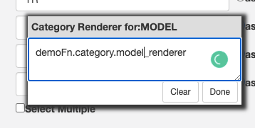
Underneath the category checkbox is another checkbox labeled “Renderer”. Clicking this reveals a pop-up window:

In this box I can enter a function string without parameters in the same way that callback functions are configured in the FVC custom properties. If a value exists in this box, then after the categories are drawn in the DataTable, the dom element for each MODEL category row is passed into the function defined in the category renderer box:
 // does this group need a renderer?
if (o.columnCategory[x].categoryRenderer != null && o.columnCategory[x].categoryRenderer != "" ) {

	$('.group-'+o.columnCategory[x].itemName).each(function() {

		var fnstring = o.columnCategory[x].categoryRenderer;
		if ((typeof fnstring) == "undefined" || fnstring == null) {
			return;
		}
		if (fnstring.indexOf('.') > -1) {
			var fn = window.getFunctionFromString(fnstring);
		} else {
			var fn = window[fnstring];
		}

		// is object a function?
		if (typeof fn === "function")  {
			fn(this);
		} else {
			console.log("renderer error")
			return;
		}
	});
}
In the screen below I’ve entered a function name into the category renderer box. This is just a client-side JavaScript function that lives in a demos script library.
Category Renderers are JavaScript functions
Starting simple, I’m just going to change the font for the MODEL category row. *Technically* this should be done with CSS instead of a renderer, but it’s fine for a simple example:
model_renderer : function(_this) {
	// _this is the row dom element
	console.log('category renderer')
	$(_this).css({
		'font-family':'Oswald',
		'font-size':'1.25em'
	})
}
A more practical use for the category renderer is to manipulate the dom node for the category. For this next example I’m going to wrap the category value in a Bootstrap label:
model_renderer : function(_this) {
	// _this is the row dom node

	$(_this).css({
		'font-family':'Oswald',
		'font-size':'1.25em'
	});


	// add a Bootstrap label
	var v = $('.group_value',$(_this)).text();
	$(_this).find('.group_value').addClass("label label-success")

}
Checkout the demo: http://demos.xpage.me/demos/datatables-xpages-bootstrap.nsf/viewCategories.xsp?viewdef=ferraris-category-renderer&key=make:ferrari

Summary
In summary, Category Renderers can be a valuable, low-code tool that adds functionality to Views created with the Flexible View Control for XPages and provide a more rich experience for your users.
A Flexible View Control for XPages Part 10 – Multiple Views Using Tabs
Posted: May 11, 2020 Filed under: Bootstrap, DataTables, Domino, Flexbox, JavaScript, XPages | Tags: Bootstrap, Domino, Flexbox, JavaScript, XPages Leave a commentIf you’ve been a Domino Developer long enough, then you remember when embedded views were added to Lotus Notes (version 5?) and how it turned your world upside down with the information you could easily make available to users on one form.
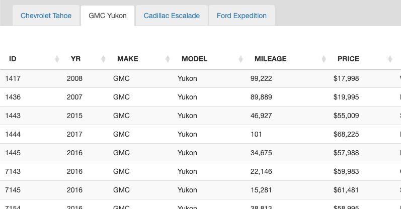
Combining The Flexible View Control with Bootstrap tabs makes adding this type of functionality to your XPages application incredibly easy. The demo below uses the used car database to display a few different types of large SUVs on one XPage in different tabs. Each tab is sourced from the same view that contains 2.2 million documents but is categorized creatively to easily drill down to the desired data.
Now, you don’t have to use Bootstrap tabs (or any tabs for that matter) – I do since I’m using Bootstrap as my layout framework and this page has the standard out-of-the-box tab setup with a tab strip navigator and tab. The entire page layout looks like this:
<div class="level0-flex-container">
		<div class="level0-flex-item">
			<xc:ccNav></xc:ccNav>
		</div>
		<div class="level0-flex-view">
			<div class="level0-flex-item" style="padding-top:10px;background:#ddd">
				<ul class="nav nav-tabs" role="tablist">
					<li role="presentation" class="active" style="margin-left:25px;">
						<a href="#tahoe" aria-controls="tahoe" role="tab" data-toggle="tab"
							class="tahoe">
							Chevrolet Tahoe
						</a>
					</li>
					<li role="presentation">
						<a href="#yukon" aria-controls="profile" role="tab" data-toggle="tab"
							class="yukon">
							GMC Yukon
						</a>
					</li>
					<li role="presentation">
						<a href="#escalade" aria-controls="messages" role="tab"
							data-toggle="tab" class="escalade">Escalade</a>
					</li>
					<li role="presentation">
						<a href="#expedition" aria-controls="settings" role="tab"
							data-toggle="tab" class="expedition">Expedition</a>
					</li>
				</ul>
			</div>
			<div class="tab-content"
				style="">
				<div role="tabpanel" class="tab-pane active flex-tab" id="tahoe"
					style="">
					<Flexible View Control>
				</div>
				<div role="tabpanel" class="tab-pane flex-tab" id="yukon"
					style="">
					<Flexible View Control>
				</div>
				<div role="tabpanel" class="tab-pane flex-tab" id="escalade"
					style="">
					<Flexible View Control>
				</div>
				<div role="tabpanel" class="tab-pane flex-tab" id="expedition"
					style="">
					<Flexible View Control>
				</div>
			</div>
		</div>
</div>
Flexbox, again
If you read Part 8 of this series, then you probably remember how important of a role Flexbox plays in the layout of the Flexible View Control. Getting the FVC to size properly in a Bootstrap tab panel is no different. We add a little extra CSS to make those tab panels flex so the view control fills up the available space in each tab:
.tab-content {
	flex:1;
	position:relative;
	flex-basis:auto;
	display:flex;
	flex-direction:column;
}
.tab-pane.flex-tab {
	display:flex;
	flex:1;
	position:relative;
	flex-basis:auto;
	flex-direction:column
}
.tab-pane.flex-tab {
	display:none !important;
}
.tab-pane.flex-tab.active {
	display:flex !important;
}
Now that the page is laid out we can add our view controls to each tab panel. The image below shows the FVC for the first tab, although the other three tabs are essentially configured the same.
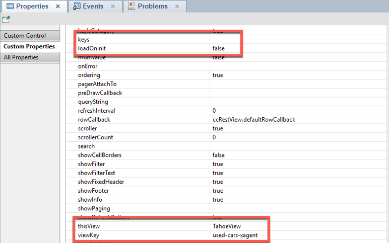
Remember: thisView must be unique! This is what allows multiple views to be added to one XPage.
An important takeaway from the highlighted areas in the screenshot above: loadOnInit: false. Setting loadOnInit directly in the control will override the value defined in the View Definition. We set it to false here because we want to build the table manually, and even though the page has four views, we only want to fetch the data for the ‘active’ tab when the page loads:
$( document ).ready(function() {
	TahoeView.build({
				params: 'category=make:Chevrolet:model:Tahoe&view=xspAll'
	});
}
- When loadOnInit: true the control will automatically execute the .build() function.
- When loadOnInit: false the DataTable can be built manually by calling [thisView].build().
- Refresh a view at anytime by calling [thisView].build()
So how do we load the data for the other tabs? In Part 7 – Modals & Picklists, we talked about needing to wait until a modal was ‘shown’ before building the view in a Picklist to make sure that the DataTable sized correctly. Similarly here, to load a view in a tab we need to wait until that tab is ‘shown’. To do that, again, we tap into a Bootstrap event:
$('.tahoe').on('shown.bs.tab', function (e) {
	// Even though this view is built on page load
	// the shown property can be set so the view refreshes
	// when this tab is made active again
		TahoeView.build();
});

$('.yukon').on('shown.bs.tab', function (e) {
		YukonView.build({
			category:'make:GMC:model:Yukon',
			params:'view=xspAll'}
		);
});

$('.escalade').on('shown.bs.tab', function (e) {
		EscaladeView.build({
			'category':'make:Cadillac:model:Escalade',
 			params:'view=xspAll'});
});

$('.expedition').on('shown.bs.tab', function (e) {
		ExpeditionView.build({
			category:'make:Ford:model:Expedition',
			params:'view=xspAll'});
});
What about those .build() parameters?
As you probably noticed in the snippets above, we didn’t define the keys/category for the views within the control. We could have, but the FVC makes it possible to pass options to the .build() command. This is a huge part of what makes the Flexible View Control so ‘flexible’. More in this in the next blog post!
A Flexible View Control for XPages Part 9 – Using Scroller for Large Views
Posted: May 4, 2020 Filed under: Bootstrap, DataTables, Domino, JavaScript, XPages | Tags: Bootstrap, CSS, DataTables, Domino, JavaScript, XPages 2 CommentsUp to this point, the examples I’ve created to demonstrate the capabilities of the FVC have used fairly small sets of data. In a real-world production scenario there is going to be a need to display datasets of various sizes, including thousands of records. So how does the FVC scale for larger sets of data?
Understanding DataTables
Comprehending what is going on behind the scenes of DataTables is vital to developing a strategy to handle large sets of data efficiently. Similar to XPages, DataTables has a “lifecycle” where a series of events occur in the initialization of the table. Previously, I created a bunch of “pure” DataTables demos, one of which highlights the various phases (callbacks) of the lifecycle (turn on your developer console):
http://demos.xpage.me/xpages/mwlug/datatables.nsf/demoRestLifecycle.xsp

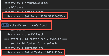
The image above shows browser consoles statements to demonstrate what the lifecycle looks like for a DataTable with 25 records. Take a close look and you’ll see that drawCallback executes multiple times. This means DataTables has drawn the table twice as part of the initialization. A good comparison to this in the XPages lifecycle is the renderResponse phase.
Now, let’s focus on the rowCallback and createdRow callbacks. In this table with 25 rows each of these is called every time DataTables processes a row of data. Normally, you are likely to only use one or the other – both are included here for demonstration purposes. Regardless of which callback you use, the code that resides there will be executed for each row. If your DataTable is replicating the functionality of a Notes View, then you’re likely to have click and double-click events at a minimum.
Now imagine you have a view with a large amount of data – thousands of records, for example. Your rowCallback is now executing THOUSANDS of times, resulting in slower rendering of your DataTable and negatively impacting the user experience. YIKES!
Large Datasets – Notes Views vs. Web Views
Anyone that has used Lotus Notes and Domino for years has been spoiled by having views with thousands (or millions) of records, nicely indexed, and extremely performant as you click on columns to re-sort or search the view based on a key. This is one thing that Notes does really, really well, but sending thousands to millions of rows to a view in a web application can seem like a fool’s errand.
While I certainly continue maintaining large Notes views on the back-end, I use categories, keys, and server-side searching to make it easy for users to target the information they need so only a small subset of information is sent to the client-side web view.
I feel like my magic number is about 5000 records or less. Any more than that and users are waiting too long. Obviously, there are going to be use cases where that is not possible and there are other factors to consider, such as server processing power and bandwidth between the client and server.
Pagers
Paging is one way to deal with large amounts of data and can be turned on with a simple paging: true as part of the initialization options within DataTables. But let’s say you have 4000 records and 50 records show up on each page. This results in 80 pages. Do you want to page through 80 pages of data? Do you want your users to page through 80 pages of data? NO!
Enter Scroller
I’ve said this before in previous posts and presentations but it bears repeating again – the more I use DataTables and the more I have challenging business requirements that at first glance seems like I might have to hack a solution together, ultimately DataTables has a fairly simple way to achieve the desired result. Displaying large amounts of data in a performant way is no different.
DataTables has a plugin called Scroller that does a great job of managing large amounts of data. It does so by only “drawing” the rows that are visible within the scroll body of the table plus extra rows so when the user starts scrolling the table is able to respond quickly. As the user scrolls, the scroller plugin draws more rows. All of the features of DataTables still work as you expect them to – filtering, sorting, etc. Technically, DataTables is using paging functionality behind the scenes to manage the data,
Enabling Scroller in the FVC
The Flexible View Control has the ability to utilize Scroller. Do the following to turn it on:
- Make sure you are loading the Scroller plugin resources. I’m loading the plugin via a CDN in my theme:
<resources>
	<styleSheet
			href="https://cdn.datatables.net/scroller/2.0.0/css/scroller.dataTables.min.css">
	</styleSheet>
</resources>
<resource>
	<content-type>application/x-javascript</content-type>
		<href>https://cdn.datatables.net/scroller/2.0.0/js/dataTables.scroller.min.js</href>
</resource>
2. You must have showFixedHeader: true on your FVC. Scroller will not work properly without fixed headers being turned on.
3. Set scroller: true in the FVC custom properties.

Demos
This page contains multiple demos that illustrate the dramatic effect scroller has on loading large amounts of data.
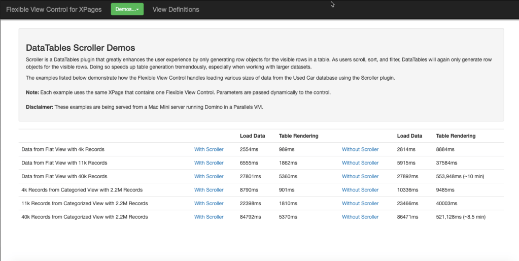
Focusing on the first line of the page above, these two sets of console statements highlight the significant difference in loading time between two tables that have the same ~5000 records, one without scroller, one with scroller.

- The first thing we notice is the data is retrieved from the server in the same amount of time in both scenarios.
- In the first console image where scroller is not enabled, every row is being processed by DataTables at initialization, which drastically slows down the table build vs. the second console image, where scroller is enabled.
- Finally, we see a dramatic difference in the build times between the two tables. 11 seconds is a lifetime compared to 1 second and as tables get bigger the 10-second difference will grow in magnitude.
Some Minor Side-Effects
Using scroller does come with a couple of side-effects, but they are fairly minor and shouldn’t have much of an impact.
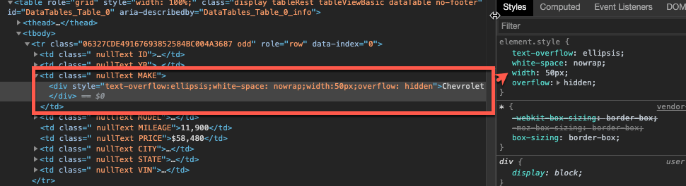
Since the scroller plugin relies on precise calculations to build the table rows, it forces each row to be the same height. This is really only a problem if you have one column that has one or more records that have extraordinarily long data. Scroller will stretch that column out so all of the data can fit within that row height.
Luckily, the FVC View Definition makes it easy to overcome this. All you need to do is explicitly define a max width for your column and check the “Hide Overflow” box:
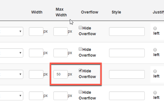
The result is your column tries to honor the width you’ve assigned and any text that exceeds that width is truncated with an ellipsis:

The other noticeable side-effect is simply cosmetic and can easily be overridden with CSS. When a table does not have enough data to fill the table body, scroller fills the white space with a background image:
If your users don’t like it, you can use the following CSS to override the background to be whatever you want:
div.dts div.dataTables_scrollBody {
     background:#fff;
}
Conclusion
The numbers above are pretty clear – using scroller will greatly improve the performance of the Flexible View Control when your table has a large amount of data and a difference can be seen with as few as 2-300 records. Every view in my application now has scroller enabled.
A Flexible View Control for XPages Part 8 – Putting the 'Flex' in Flexible
Posted: April 15, 2020 Filed under: Bootstrap, DataTables, Domino, Flexbox, JavaScript, jQuery, XPages | Tags: Bootstrap, DataTables, Domino, Flexbox, JavaScript, jQuery, XPages 1 CommentThus far, all of my demonstrations of the Flexible View Control have been centered around starting from scratch and integrating the view control into a mostly blank page, aside from a basic Bootstrap layout. Even the basic Bootstrap layout I’ve been using contains some very important elements that are integral to the control sizing properly, whether you are starting with a blank page or trying to integrate into an existing application.
Enter Flexbox
For years I read about Flexbox and how it can simplify the layout of pages and I always managed to push learning it to the back burner. Once I did all I could think is WHY DIDN’T I LEARN THIS SOONER?!?!? Prior to that, I probably did an embarrassing amount of dynamic element sizing with JavaScript. I can’t stress this enough … Flexbox has fundamentally changed how I approach application layout.
So what exactly is Flexbox?
The
from css-tricks.comFlexbox Layout(Flexible Box) module (a W3C Candidate Recommendation as of October 2017) aims at providing a more efficient way to lay out, align and distribute space among items in a container, even when their size is unknown and/or dynamic (thus the word “flex”).
An important concept to understand is flexible containers are not an “all-in” or “all-out” proposition. You can mix flexed elements with non-flexed elements on the same page, depending on what you’re trying to accomplish.
DataTables and Fixed Headers
Before showing how the FVC integrates Flexbox, a little background. When displaying view data in an application, if the amount of data in the view requires the user to scroll, having fixed headers naturally creates a better user experience. This can be achieved in out-of-the-box DataTables in two ways:
- By adding the parameter ‘scrollY’ to the configuration options with a px value > 0. For example, “scrollY”: “200px”
- By utilizing the DataTables Fixed Header plugin
The pros and cons of each based on my experience are below.
| Method | Pros | Cons |
| scrollY | Built into DT | Requires a hard-coded height value. |
| Fixed Header plugin | Also can create a fixed footer | Requires loading an additional 30k js file, does not handle responsiveness well |
Before using Flexbox for dynamic sizing, the Flexible View Control used the scrollY method to define an initial height and then after the table was rendered, the height of the scroll body would be recomputed so that the table would fit into the parent container. This involved a lot of taking measurements of various elements such as the table offset, header height, filter height, info height, etc. and creating a formula to calculate the correct height needed for the scroll body. It worked great but I really wanted a “cleaner” way to layout the table elements… and I found that with Flexbox.
The Flexible View Control and Fixed Header/Footer
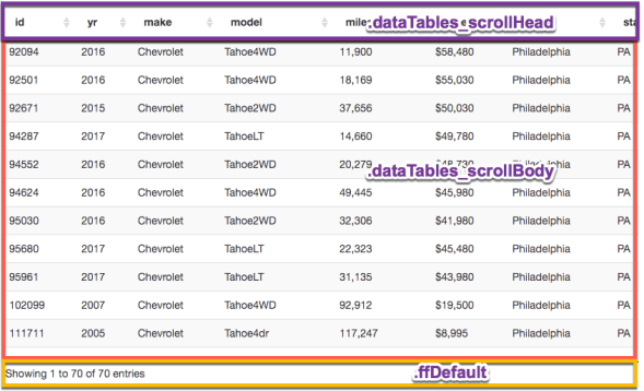
The FVC has a parameter showFixedHeader which is set to true by default. When fixed headers are enabled, the control creates the scrollY option parameter for DataTables at runtime. The value is irrelevant .. the purpose is for DataTables to trigger the dom changes needed to make the table body scrollable:
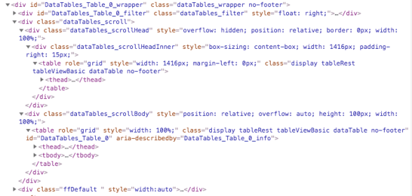
The key elements here are dataTables_scrollHead, dataTables_scrollBody, and ffDefault. The first two are created by DataTables at initialization. The third, ffDefault is created by the FVC.
Now that we know what the elements are, we need to get them to “flex” by overriding their default styling. The snippet below displays the CSS from the FVC that allows us to accomplish that.
/********************************
 DataTables overrides
*********************************/
.dataTables_wrapper {
	flex:1;
	display:flex;
	flex-direction:column;
}
.dataTables_scroll {
	flex:1;
	display:flex;
	flex-direction:column;
}
.dataTables_scrollBody {
	flex:1;
	flex-basis:auto;
	flex-basis:0;
}
.dataTables_scrollHead {
	flex:1;
	flex-basis: auto;
	flex-grow: 0;
	position:relative;
}
.dataTables_filter input {
    display: inline;
    width: 250px;
    margin-left: 5px;
}
div.dts {
	display: flex !important;
}
/************************/
FIXED FOOTER
/************************/
.ffDefault {
	flex:1;
	flex-grow:0;
	flex-basis:auto;
	height:35px; /* Not required */
	position:relative;
}
With the CSS above we have the DataTables dom elements configured to flex. But we need to do some more flexin’ to get the layout to flow the way we want. Continuing to work our way up the dom hierarchy, we flex the wrapper that the FVC places around the DataTables dom:
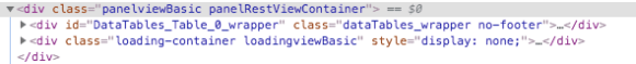
.panelRestViewContainer {
	display:flex;
	flex-direction:column;
	height:auto;
	position:relative;
	flex:1;
}
Remember the ultimate goal
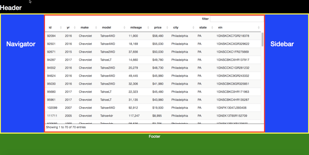
We want our view to fit in the space being provided by the flexed layout without having to hardcode dimensions or compute dimensions dynamically. This requires the top-most flexed container defining its height either through pixels or through the viewport height (vh). The demos being used throughout this series (such as this) use the following dom hierarchy (simplified for illustration):
<body>
	<div class="level0-flex-container">
		<div class="level0-flex-item">
			Navbar
		</div>
		<!-- Flexible View Control -->
		<div class="panelRestViewContainer">

		</div>
	</div>
</body>
body, form {
	/* very important! */
	overflow:hidden;
}
.level0-flex-container {
	display:flex;
	flex-direction:column;
	height:100vh; /* will fill the window viewport */
}
.level0-flex-item {
	flex:1;
	flex-basis: auto;
	flex-grow: 0; /* this element will size to its content */
	position:relative;
}
What this all means:
- Body and form elements will not scroll
- Which allows for the flex container to fill the viewport
- The navbar, with flex-grow: 0, will only get as tall as its content
- The Flexible View Control, with flex-grow: 1 (through the shorthand flex:1 property) will expand to fill the remaining empty space in the container.
The end result is our view filling the screen with scrollable content, just as we wanted.
More Layout Demos
The demos below illustrate how easy it is to create several different flexible layouts and to add the FVC to XPage layout controls:
- Starting with a flexible container
- Adding a header
- Adding the Flexible View Control
- Add an action bar
- Add a footer
- Add a left-side navigator
- Add a footer
- Add a right sidebar
- FVC with NO fixed header in a flexible layout
- Adding the Flexible View Control to an Editable Area
- Adding the Flexible View Control to an Application Layout control
 XPage.me