A Flexible View Control for XPages Part 10 – Multiple Views Using Tabs
Posted: May 11, 2020 Filed under: Bootstrap, DataTables, Domino, Flexbox, JavaScript, XPages | Tags: Bootstrap, Domino, Flexbox, JavaScript, XPages Leave a commentIf you’ve been a Domino Developer long enough, then you remember when embedded views were added to Lotus Notes (version 5?) and how it turned your world upside down with the information you could easily make available to users on one form.
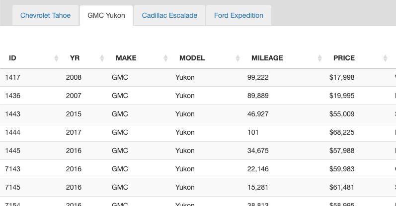
Combining The Flexible View Control with Bootstrap tabs makes adding this type of functionality to your XPages application incredibly easy. The demo below uses the used car database to display a few different types of large SUVs on one XPage in different tabs. Each tab is sourced from the same view that contains 2.2 million documents but is categorized creatively to easily drill down to the desired data.
Now, you don’t have to use Bootstrap tabs (or any tabs for that matter) – I do since I’m using Bootstrap as my layout framework and this page has the standard out-of-the-box tab setup with a tab strip navigator and tab. The entire page layout looks like this:
<div class="level0-flex-container">
		<div class="level0-flex-item">
			<xc:ccNav></xc:ccNav>
		</div>
		<div class="level0-flex-view">
			<div class="level0-flex-item" style="padding-top:10px;background:#ddd">
				<ul class="nav nav-tabs" role="tablist">
					<li role="presentation" class="active" style="margin-left:25px;">
						<a href="#tahoe" aria-controls="tahoe" role="tab" data-toggle="tab"
							class="tahoe">
							Chevrolet Tahoe
						</a>
					</li>
					<li role="presentation">
						<a href="#yukon" aria-controls="profile" role="tab" data-toggle="tab"
							class="yukon">
							GMC Yukon
						</a>
					</li>
					<li role="presentation">
						<a href="#escalade" aria-controls="messages" role="tab"
							data-toggle="tab" class="escalade">Escalade</a>
					</li>
					<li role="presentation">
						<a href="#expedition" aria-controls="settings" role="tab"
							data-toggle="tab" class="expedition">Expedition</a>
					</li>
				</ul>
			</div>
			<div class="tab-content"
				style="">
				<div role="tabpanel" class="tab-pane active flex-tab" id="tahoe"
					style="">
					<Flexible View Control>
				</div>
				<div role="tabpanel" class="tab-pane flex-tab" id="yukon"
					style="">
					<Flexible View Control>
				</div>
				<div role="tabpanel" class="tab-pane flex-tab" id="escalade"
					style="">
					<Flexible View Control>
				</div>
				<div role="tabpanel" class="tab-pane flex-tab" id="expedition"
					style="">
					<Flexible View Control>
				</div>
			</div>
		</div>
</div>
Flexbox, again
If you read Part 8 of this series, then you probably remember how important of a role Flexbox plays in the layout of the Flexible View Control. Getting the FVC to size properly in a Bootstrap tab panel is no different. We add a little extra CSS to make those tab panels flex so the view control fills up the available space in each tab:
.tab-content {
	flex:1;
	position:relative;
	flex-basis:auto;
	display:flex;
	flex-direction:column;
}
.tab-pane.flex-tab {
	display:flex;
	flex:1;
	position:relative;
	flex-basis:auto;
	flex-direction:column
}
.tab-pane.flex-tab {
	display:none !important;
}
.tab-pane.flex-tab.active {
	display:flex !important;
}
Now that the page is laid out we can add our view controls to each tab panel. The image below shows the FVC for the first tab, although the other three tabs are essentially configured the same.
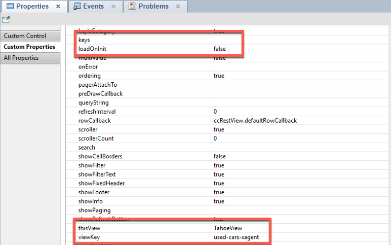
Remember: thisView must be unique! This is what allows multiple views to be added to one XPage.
An important takeaway from the highlighted areas in the screenshot above: loadOnInit: false. Setting loadOnInit directly in the control will override the value defined in the View Definition. We set it to false here because we want to build the table manually, and even though the page has four views, we only want to fetch the data for the ‘active’ tab when the page loads:
$( document ).ready(function() {
	TahoeView.build({
				params: 'category=make:Chevrolet:model:Tahoe&view=xspAll'
	});
}
- When loadOnInit: true the control will automatically execute the .build() function.
- When loadOnInit: false the DataTable can be built manually by calling [thisView].build().
- Refresh a view at anytime by calling [thisView].build()
So how do we load the data for the other tabs? In Part 7 – Modals & Picklists, we talked about needing to wait until a modal was ‘shown’ before building the view in a Picklist to make sure that the DataTable sized correctly. Similarly here, to load a view in a tab we need to wait until that tab is ‘shown’. To do that, again, we tap into a Bootstrap event:
$('.tahoe').on('shown.bs.tab', function (e) {
	// Even though this view is built on page load
	// the shown property can be set so the view refreshes
	// when this tab is made active again
		TahoeView.build();
});

$('.yukon').on('shown.bs.tab', function (e) {
		YukonView.build({
			category:'make:GMC:model:Yukon',
			params:'view=xspAll'}
		);
});

$('.escalade').on('shown.bs.tab', function (e) {
		EscaladeView.build({
			'category':'make:Cadillac:model:Escalade',
 			params:'view=xspAll'});
});

$('.expedition').on('shown.bs.tab', function (e) {
		ExpeditionView.build({
			category:'make:Ford:model:Expedition',
			params:'view=xspAll'});
});
What about those .build() parameters?
As you probably noticed in the snippets above, we didn’t define the keys/category for the views within the control. We could have, but the FVC makes it possible to pass options to the .build() command. This is a huge part of what makes the Flexible View Control so ‘flexible’. More in this in the next blog post!
A Flexible View Control for XPages Part 8 – Putting the 'Flex' in Flexible
Posted: April 15, 2020 Filed under: Bootstrap, DataTables, Domino, Flexbox, JavaScript, jQuery, XPages | Tags: Bootstrap, DataTables, Domino, Flexbox, JavaScript, jQuery, XPages 1 CommentThus far, all of my demonstrations of the Flexible View Control have been centered around starting from scratch and integrating the view control into a mostly blank page, aside from a basic Bootstrap layout. Even the basic Bootstrap layout I’ve been using contains some very important elements that are integral to the control sizing properly, whether you are starting with a blank page or trying to integrate into an existing application.
Enter Flexbox
For years I read about Flexbox and how it can simplify the layout of pages and I always managed to push learning it to the back burner. Once I did all I could think is WHY DIDN’T I LEARN THIS SOONER?!?!? Prior to that, I probably did an embarrassing amount of dynamic element sizing with JavaScript. I can’t stress this enough … Flexbox has fundamentally changed how I approach application layout.
So what exactly is Flexbox?
The
from css-tricks.comFlexbox Layout(Flexible Box) module (a W3C Candidate Recommendation as of October 2017) aims at providing a more efficient way to lay out, align and distribute space among items in a container, even when their size is unknown and/or dynamic (thus the word “flex”).
An important concept to understand is flexible containers are not an “all-in” or “all-out” proposition. You can mix flexed elements with non-flexed elements on the same page, depending on what you’re trying to accomplish.
DataTables and Fixed Headers
Before showing how the FVC integrates Flexbox, a little background. When displaying view data in an application, if the amount of data in the view requires the user to scroll, having fixed headers naturally creates a better user experience. This can be achieved in out-of-the-box DataTables in two ways:
- By adding the parameter ‘scrollY’ to the configuration options with a px value > 0. For example, “scrollY”: “200px”
- By utilizing the DataTables Fixed Header plugin
The pros and cons of each based on my experience are below.
| Method | Pros | Cons |
| scrollY | Built into DT | Requires a hard-coded height value. |
| Fixed Header plugin | Also can create a fixed footer | Requires loading an additional 30k js file, does not handle responsiveness well |
Before using Flexbox for dynamic sizing, the Flexible View Control used the scrollY method to define an initial height and then after the table was rendered, the height of the scroll body would be recomputed so that the table would fit into the parent container. This involved a lot of taking measurements of various elements such as the table offset, header height, filter height, info height, etc. and creating a formula to calculate the correct height needed for the scroll body. It worked great but I really wanted a “cleaner” way to layout the table elements… and I found that with Flexbox.
The Flexible View Control and Fixed Header/Footer
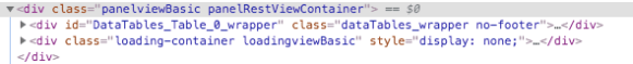
The FVC has a parameter showFixedHeader which is set to true by default. When fixed headers are enabled, the control creates the scrollY option parameter for DataTables at runtime. The value is irrelevant .. the purpose is for DataTables to trigger the dom changes needed to make the table body scrollable:
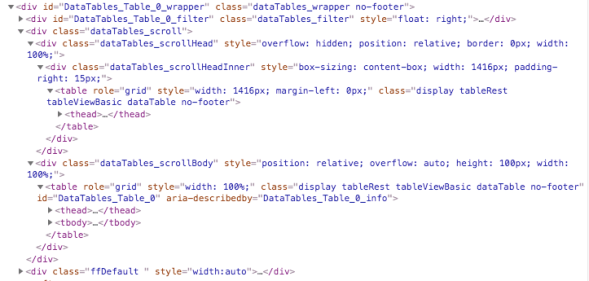
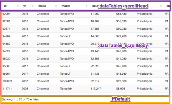
The key elements here are dataTables_scrollHead, dataTables_scrollBody, and ffDefault. The first two are created by DataTables at initialization. The third, ffDefault is created by the FVC.
Now that we know what the elements are, we need to get them to “flex” by overriding their default styling. The snippet below displays the CSS from the FVC that allows us to accomplish that.
/********************************
 DataTables overrides
*********************************/
.dataTables_wrapper {
	flex:1;
	display:flex;
	flex-direction:column;
}
.dataTables_scroll {
	flex:1;
	display:flex;
	flex-direction:column;
}
.dataTables_scrollBody {
	flex:1;
	flex-basis:auto;
	flex-basis:0;
}
.dataTables_scrollHead {
	flex:1;
	flex-basis: auto;
	flex-grow: 0;
	position:relative;
}
.dataTables_filter input {
    display: inline;
    width: 250px;
    margin-left: 5px;
}
div.dts {
	display: flex !important;
}
/************************/
FIXED FOOTER
/************************/
.ffDefault {
	flex:1;
	flex-grow:0;
	flex-basis:auto;
	height:35px; /* Not required */
	position:relative;
}
With the CSS above we have the DataTables dom elements configured to flex. But we need to do some more flexin’ to get the layout to flow the way we want. Continuing to work our way up the dom hierarchy, we flex the wrapper that the FVC places around the DataTables dom:
.panelRestViewContainer {
	display:flex;
	flex-direction:column;
	height:auto;
	position:relative;
	flex:1;
}
Remember the ultimate goal
We want our view to fit in the space being provided by the flexed layout without having to hardcode dimensions or compute dimensions dynamically. This requires the top-most flexed container defining its height either through pixels or through the viewport height (vh). The demos being used throughout this series (such as this) use the following dom hierarchy (simplified for illustration):
<body>
	<div class="level0-flex-container">
		<div class="level0-flex-item">
			Navbar
		</div>
		<!-- Flexible View Control -->
		<div class="panelRestViewContainer">

		</div>
	</div>
</body>
body, form {
	/* very important! */
	overflow:hidden;
}
.level0-flex-container {
	display:flex;
	flex-direction:column;
	height:100vh; /* will fill the window viewport */
}
.level0-flex-item {
	flex:1;
	flex-basis: auto;
	flex-grow: 0; /* this element will size to its content */
	position:relative;
}
What this all means:
- Body and form elements will not scroll
- Which allows for the flex container to fill the viewport
- The navbar, with flex-grow: 0, will only get as tall as its content
- The Flexible View Control, with flex-grow: 1 (through the shorthand flex:1 property) will expand to fill the remaining empty space in the container.
The end result is our view filling the screen with scrollable content, just as we wanted.
More Layout Demos
The demos below illustrate how easy it is to create several different flexible layouts and to add the FVC to XPage layout controls:
- Starting with a flexible container
- Adding a header
- Adding the Flexible View Control
- Add an action bar
- Add a footer
- Add a left-side navigator
- Add a footer
- Add a right sidebar
- FVC with NO fixed header in a flexible layout
- Adding the Flexible View Control to an Editable Area
- Adding the Flexible View Control to an Application Layout control
 XPage.me